
Use 'Request Service' button for further assistance.
The Argos Web Viewer is an interface to run Argos reports on any browser, be it on a Windows, Macintosh or a Linux computer. Argos Web Viewer can also be used on tablets. Supported browsers include Chrome, Firefox, and Edge for PC; Safari and Chrome for iPad/Mac and Chrome for Android tablet devices.
System Requirements
- PC, Mac, or supported tablet (iPad or Android) at 1024x768 or higher resolution.
- Internet Explorer 11, Microsoft Edge, Mozilla Firefox, or Google Chrome for PC; Safari or Chrome for iPad/Mac; or Chrome for Android.
Signing In to Argos
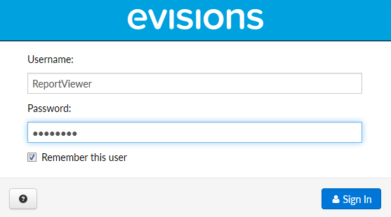
Argos Web Viewer can be launched by logging into my.missouristate.edu > Information Access card > Argos Reports (VPN). The credentials used at the initial launch of the web viewer are your Missouri State Account ID (abc123) and password (the same you would use to log in to your Missouri State computer).

Signing In When Prompted by a Dashboard or Report
There are times when running a dashboard or a report that you may be prompted once more to enter your credentials. This will require your database login and password.
The title of the dashboard or report will let you know whether it is a PROD or ODSPROD report and that will tell you which database username and password that you need to enter.
A database username is usually your first initial followed by your last name (example: BBEAR for Boomer Bear).
- If you cannot remember the username to your Database Account, you can contact the Help Desk and they can provide it for you.
- If you cannot remember your database password you can change it by changing your database password.
- If your Argos account displays an error message that the account is locked, please contact QDUG@MIssouristate.edu for assistance with unlocking.
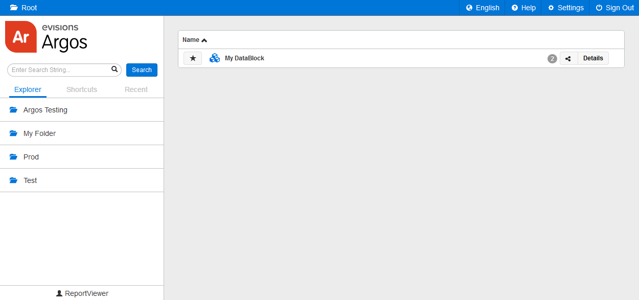
Argos Web Viewer Explorer
The Argos Web Viewer Explorer displays a list of folders on the left side of the screen. The right part of the screen shows the DataBlocks that reside in the current folder. DataBlocks are objects in Argos that contain dashboards and reports. They often have an underlying query that is used by the dashboards and reports within. When you launch Argos Web Viewer for the first time, you will be in the root Argos directory. Note that Web Viewer displays the exact same folders, DataBlocks, reports, and shortcuts that you see in the Argos Windows client.
Clicking on a folder in the left pane opens that folder. The DataBlocks in that folder appear in the main screen on the right.
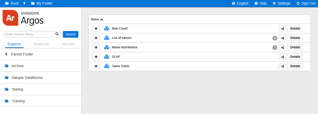
To go back up a level, click the < Parent Folder icon.
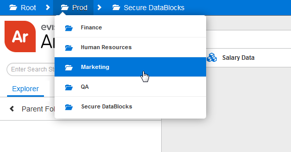
At any time, you can see where you are in the directory structure by looking at the breadcrumb trail at the top of the screen. In the screenshot above, the current location is the "My Folder" folder in the root directory. Clicking on any folder in the trail navigates to that folder. Hovering over a folder either displays its subfolders, or, if the breadcrumb trail is too long to fit on the screen, the collapsed folder structure. Again, clicking on any folder in the drop down navigates to that folder.
To return to a previous folder, click the Back button in your browser.
Running Dashboards
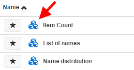
DataBlocks appear in the Explorer with blue building-block icons to their left:
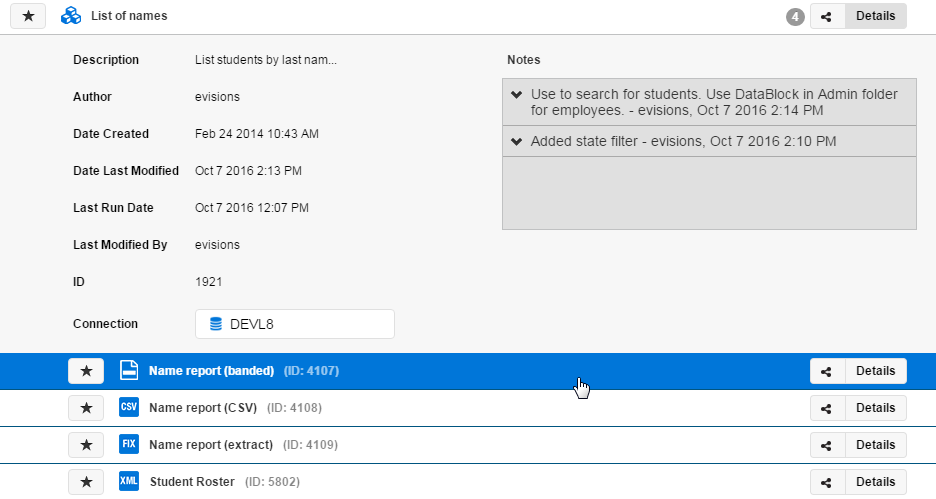
Select the Details button on the far right of any DataBlock or report to see information such as its author, creation date, last modified date, database connection, and notes. If a DataBlock has any reports, they appear when you select its Details button. Notice the small gray circle with the number 4, which indicates that this particular DataBlock has four reports.
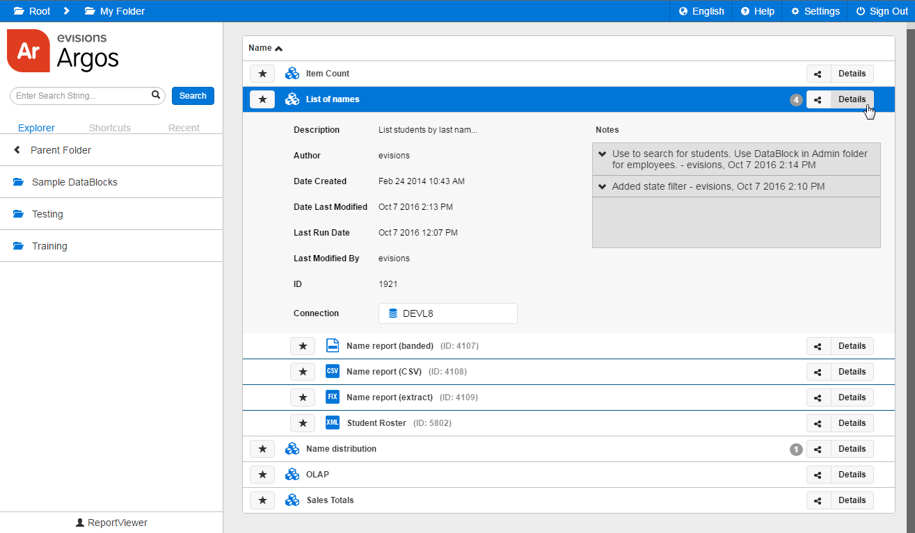
Each DataBlock has a default dashboard associated with it. Click on a DataBlock to run its default dashboard (or choose a different dashboard from the Details list).
The dashboard loads fullscreen in the browser. The top of the window still contains the breadcrumb trail, Help, Settings, and Sign Out options.
Running Reports
There are two ways to run a report: from the Explorer, and from a dashboard. Both methods involve running the default (system) dashboard for the DataBlock to allow you to specify any parameters needed to generate the report.
Method 1: Running a Report from the Explorer
First, click the Details button to the right of the DataBlock to display its reports. Then, click on the report you want to run.
This launches the default dashboard for the DataBlock. Notice the how the report you clicked on appears in the drop down at the top of the dashboard.
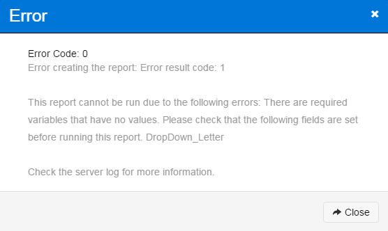
If needed, fill out the dashboard with any parameters that are required to run the report. If you omit this step, Argos will prompt you to complete the information.
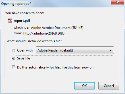
Click the Run button to launch the report. Argos supports four types of reports: CSV, banded, extract, and crosstab. Banded and crosstab reports are PDF files, and follow the default behavior for your browser when clicking on a link to a PDF. This may prompt you to save the file, or automatically open it in your browser or in PDF-reading software. Similarly, you may see an open/save prompt when generating a CSV (.csv file) or extract (.txt file) report, or the report may load directly into your browser.
Note: to save a CSV report on a tablet, you may need to have an app installed that can read CSV files.
Method 2: Running a Report from a Dashboard
If you are already in a dashboard, you can run any report associated with that DataBlock by selecting it from the Reports drop down at the top of the screen and clicking the Run button.
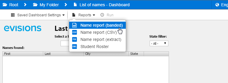
This method is preferable if you need to run more than one report based on the same input, because you only need to enter parameters in the dashboard one time instead of once for each report.
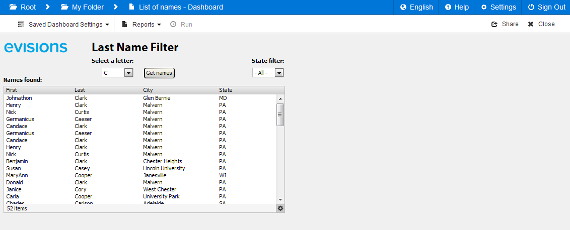
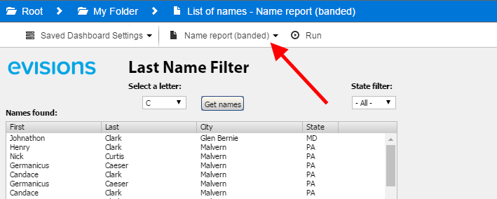
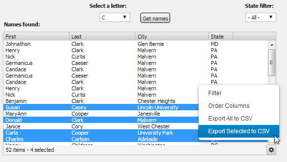
Displaying Multi-Column List Boxes
Dashboards frequently use multi-column list boxes to display a set of returned results. In the example below, when you select a letter and click the Get names button the list of users appears below.
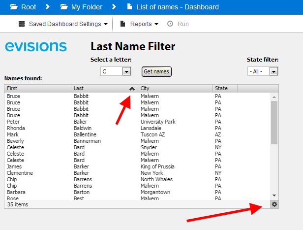
Sorting
To sort on a particular column, click the column header. Click the same header again to cycle through unsorted, ascending sort, and descending sort. Click a different column header to sort on that column instead. Sorted columns have an arrow in the header indicating the direction of the sort.
Reordering Columns
Click the gear icon in the lower right of the multi-column list box and go to Order Columns.
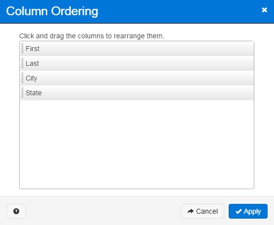
To move a column, drag it to the desired location, then click Apply.
Filtering
You can filter results based on the values in any column. Click the gear icon in the lower right of the multi-column list box and select Filter to open the Filter Options.
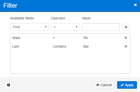
Choose the column that you want to filter on. Then, select an operator (less than, equal to, contains, etc.). Enter the value to filter on and click the plus symbol to add the filter.
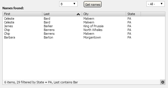
You can add as many filters as you need on a column. For example, you might want to filter out all values that are greater than three AND are less than eight. You can also filter on multiple columns. In the example above, the filter will show only people who have the string "Bar" as part of their last name (Bard, Barton, Barlowe, etc.) and live in Pennsylvania. There is an implied AND statement across all filters.
When finished, click Apply Filters to display the filtered result set.
Exporting to CSV
You can choose to export all or some of the results displayed in the list box to a CSV file on your local system. To export to CSV, click on the gear icon and choose Export All to CSV. If the DataBlock designer set up this list box so that you can select multiple rows using the Shift or Control keys and you have selected at least one row, you will also see an option to Export Selected to CSV.
In the Export Data dialog, you can choose which columns to include, reorder or rename columns, and configure various export options.
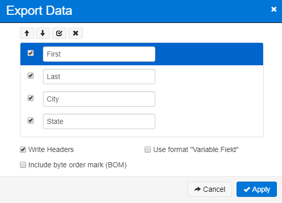
- Write Headers - Include a row containing the column names at the top of the file.
- Use format "Variable.Field" - Preface column headers with the name of the multi-column listbox object.
- Include byte order mark (BOM) - Some programs, such as Microsoft Excel, require a byte order mark in the file to render extended ASCII characters correctly. You should check this box if there may be foreign characters in the data and you will be opening the CSV file in such a program.
The exported CSV file will contain exactly the rows you specified, including any custom sorting or filters.
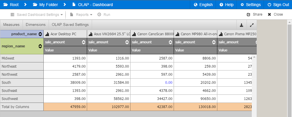
Using OLAP Cubes
OLAP stands for online analytical processing. An OLAP cube is a type of object that can be included on a dashboard which makes it easy for users to change how the data is presented on the screen. The DataBlock designer defines certain dimensions, e.g., attributes that the data can be sorted on, and what the measures are (the counts, amounts, or other numbers that are being measured). The report viewer can then pick and choose at run time which dimensions they want to use, and how the data should be broken down.
When you first load an OLAP cube, you will see data in its default view as configured by the DataBlock Designer.
If this cube has previously-saved OLAP settings, you can load them by clicking on the OLAP Saved Settings button at the top of the cube. This dropdown displays any saved settings that you created, as well as ones created and shared by other users.
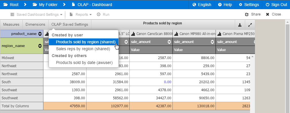
After loading a saved OLAP setting, the name of the setting will appear at the top of the cube.
Note: The Web Viewer currently only supports loading existing saved OLAP settings. New saved OLAP settings can be created in the Argos client. The Argos client also allows you to "pin" a saved OLAP setting as the default view that will be loaded when running the DataBlock.
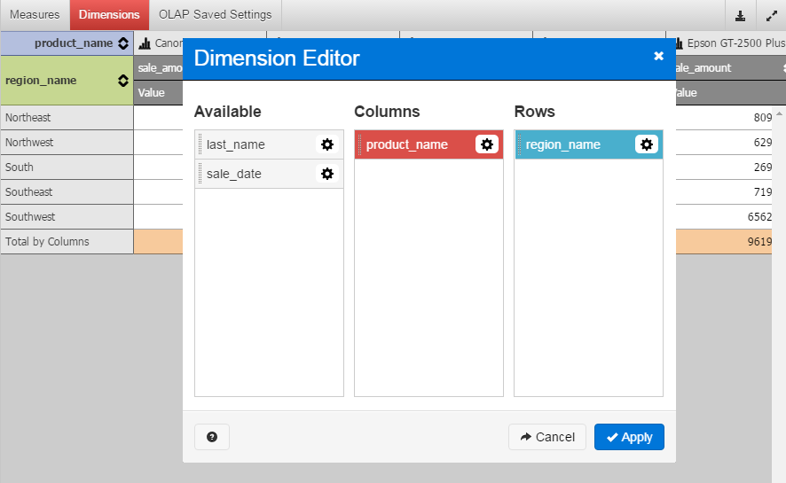
Dimensions
Click the Dimensions button to configure the cube. The Dimension Editor has lists of the available and displayed dimensions. You can click and drag each dimension into the Columns or Rows lists, or drag it back into the Available column to remove it from the cube.
You can choose to enable Previous or Next Forecasting, which extrapolates one additional data point in each direction ("preceding" and "consequent" values). Argos supports several different forecast calculation methods, which you can choose from the dropdown list.
Forecasting Methods
Argos provides six different forecasting algorithms for you to choose from:
- No forecasting - Do not include any forecasted values in the data.
- Moving average - The best-known forecasting method is the moving averages method. It simply takes a certain number of past periods and adds them together, then divides the result by the number of periods. Simple moving averages (MA) is an effective and efficient method provided the time series is stationary in both mean and variance. The following formula is used in finding the moving average of order n, MA(n) for a period t+1: MAt+1 = [Dt + Dt-1 + ... +Dt-n+1] / n where n is the number of observations used in the calculation.
- Weighted moving average - Very powerful and economical. It is widely used where repeated forecasts require methods like sum-of-the-digits and trend adjustment methods. An example of a weighted moving averages calculation is as follows: Weighted MA(3) = w1.Dt + w2.Dt-1 + w3.Dt-2 where the weights are any positive numbers such that: w1 + w2 + w3 =1. Typical weights for this example are: w1 = 3/(1 + 2 + 3) = 3/6, w2 = 2/6, and w3 = 1/6.
- Double/Triple exponential smoothing - One of the most successful forecasting methods is the exponential smoothing (ES) method. While the simple MA method is a special case of the ES, the ES is more conservative in its data usage. It also offers the following advantages:
- It can be modified to be used effectively for time series with seasonal patterns.
- It is easy to adjust for past errors.
- It is easy to prepare follow-on forecasts, which are ideal for situations where many forecasts must be prepared and several different forms are used depending on the presence of trend or cyclical variations.
In short, an ES is an averaging technique that uses unequal weights, where the weights applied to past observations decline in an exponential manner, as follows: Ft+1 = a Dt + (1 - a) Ft where:
Dt is the actual value
Ft is the forecasted value
a is the weighing factor, which ranges from 0 to 1
t is the current time period.
Notice that the smoothed value becomes the forecast for period t + 1.
A small value for 'a' provides a lot of smoothing while a large value provides a fast response to the recent changes in the time series and a smaller amount of smoothing. Notice that the exponential smoothing and simple moving average techniques will generate forecasts having the same average age of information if moving average of order n is the integer part of (2-a)/a.
An exponential smoothing over an already-smoothed time series is called double-exponential smoothing. In some cases, it might be necessary to extend it to triple-exponential smoothing. While simple exponential smoothing requires stationary condition, the double-exponential smoothing can capture linear trends and triple-exponential smoothing can handle almost all other business time series.
- Show only min/max values - The "Preceding" and "Consequent" fields will contain the min and max values that appear in that row or column.
- Show first and last values - The "Preceding" and "Consequent" fields will repeat the first and last values that appear in that row or column.
Note: If a dimension has fewer than three data points, the forecasting value will be 0 as there is not enough information to extrapolate a value. Forecasted values are not part of the cube data, so some views of the measure (like ranks, record count, prev/next items, etc.) will be 0 when applied to rows or columns with forecasted values. Forecasted values are not included in total/subtotal calculations, but are included in running total calculations.
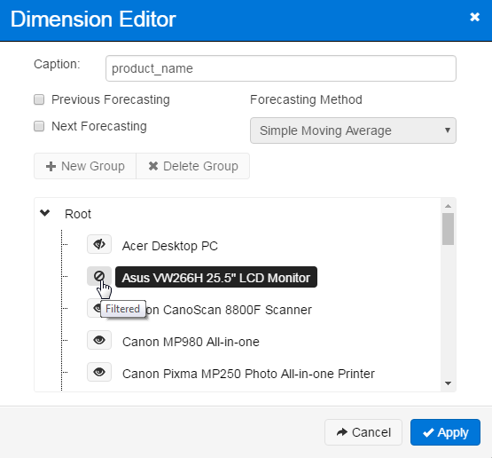
The Dimension Editor also allows you to set up custom groups of values and to filter or hide unwanted values from the cube.
Click + New Group to add a group, which you can then name as desired. Drag and drop values from the root list into the new group(s) until they appear as you want them.
Clicking on the eye icon next to each value toggles it between the visible, invisible, and filtered states. Invisible values are not displayed in the cube, but the data associated with that value is still included in the totals. Filtered values are neither visible nor included in the totals.
When viewing the cube, if any dimensions have invisible or filtered values, the Dimensions button is highlighted in blue or red, respectively. When the Dimension Editor is open, the names of the dimensions similarly show the color coding to indicate the presence of invisible and filtered values.
Dimensions containing both filtered and invisible values are also shown in red.
Measures
Measures are the sums, totals, or other calculations that display in the OLAP cube. They are the information you are looking for based on the dimensions. Click Measures to open the Measure Manager where you can define which measures appear in the cube and how they display. Use the Add Measure button to create customized additional measures.
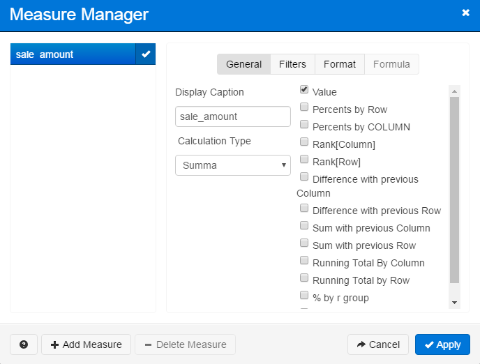
When a measure has min/max value filters applied, the Measures button at the top of the OLAP cube appears in red to indicate the presence of filtering.
Viewing Data
Once the cube has been constructed, you can use the following buttons to sort, expand, or view graphical data.

To expand the OLAP cube to use the full window, click the button in the upper right of the cube.
OLAP Charts
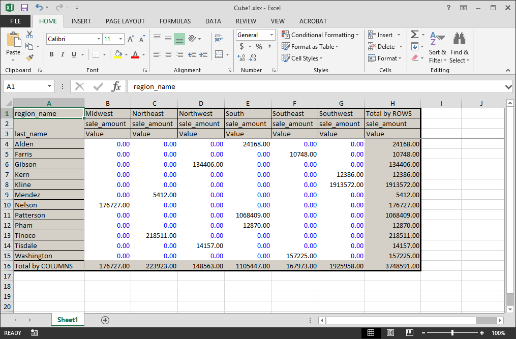
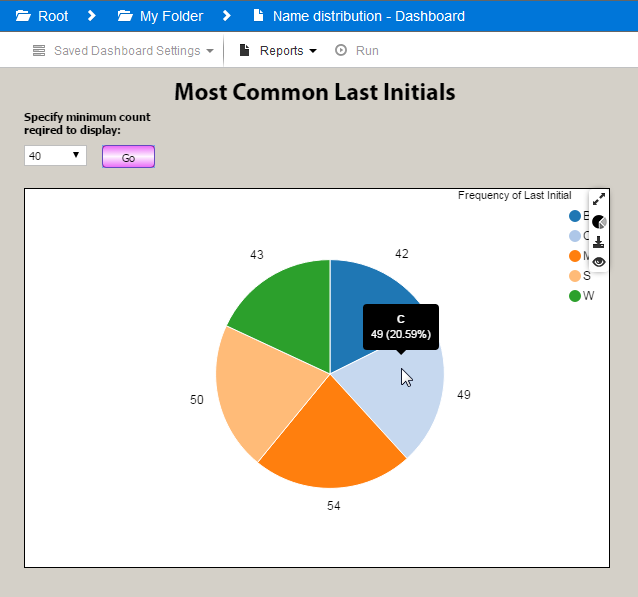
Clicking the chart icon at the top of any column in an OLAP cube brings up a graph of the data for that column. In the first example above, the columns in the OLAP cube show a list of sale amounts for each product. Clicking the chart icon next to the Asus VW266H 25.5" LCD Monitor brings up the following graph:
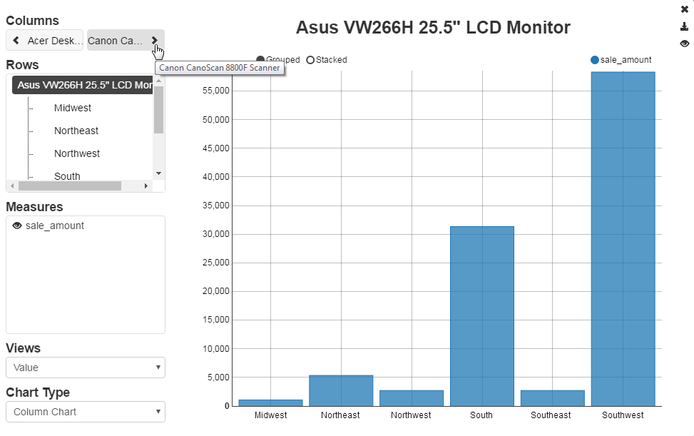
- Columns - Click the left or right arrows to see the graph for the previous or next column in the OLAP cube.
- Rows - Select the row(s) you want included in the chart.
- Measures - Select the measure(s) you want included in the chart. Each measure is a new chart series.
- Views - When you configure your measures, you can include one or more views for the data in the OLAP cube. For example, you can interpret the data as a plain value; display percents by row or column; show the difference with previous rows or columns; etc. The Views drop down allows you to choose which of the enabled views to display in the chart.
- Chart Type - Change the chart type. You can view OLAP charts as column, line, point, pie, or area charts. Note: If you select more than one measure, you will not be able to select a pie chart as this type of chart can only display one series at a time.
Exporting OLAP Data to Excel
To export the data currently being shown in the OLAP cube, click the Export to Excel button in the upper right of the cube, next to the Fullscreen button:
This will download an .xlsx file to your machine. Unlike in previous versions of Argos, you do not need to have Microsoft Excel installed to download the file. Once the download is complete, you can then open the file in a spreadsheet program of your choosing.
Viewing Charts
Charts in the Argos Web Viewer are similar to charts in the Argos Windows client, but have a slightly different look and feel. At this time, charts in the Web Viewer only support the default color scheme; future releases may include some or all of the available themes and color palettes.
Hovering the mouse over a data point on the chart point displays more detailed information about that data point.
Chart Type
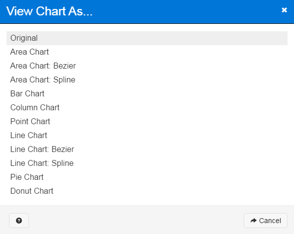
One of the most useful features of charts in Argos Web Viewer is that you can change the chart type on demand. When the mouse cursor is anywhere on the chart, four icons appear in the upper right corner. Clicking the second icon that looks like a pie chart brings up a dialog that allows you to choose the chart type:
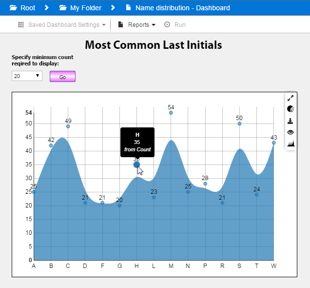
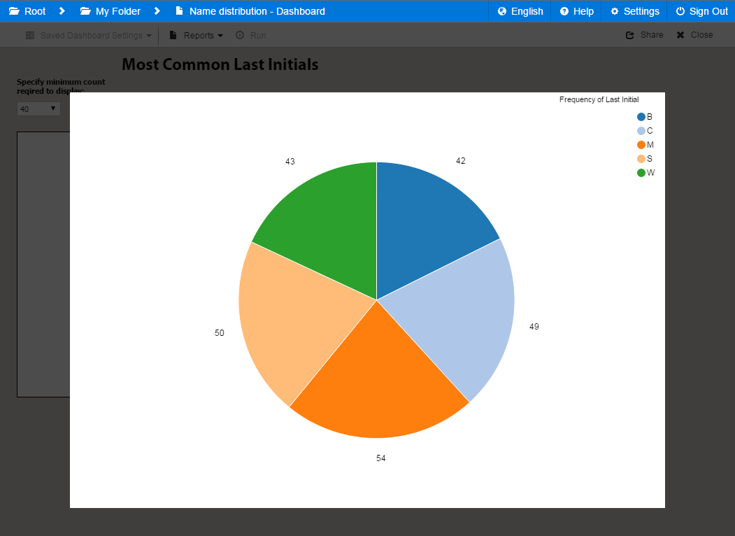
In this example, using an area chart (Bezier) makes it easy to see how many letters occur infrequently versus how many appear frequently, and to identify the higher values easily.
Fullscreen View
Clicking the double arrow icon in the upper right hand corner of the chart brings up fullscreen view, which resizes the chart to take up the full window and dims the background.
Click the X that appears when you mouse over the upper right corner of the chart to return to the normal dashboard view.
Saving Charts
Click the download button when hovering over any chart to save the current chart view as a .png file.

Show/Hide Labels
The eye button toggles the display of labels for each data point on the chart.

Changing the Data View
Area and bar charts provide different options for how the chart data is represented. To change the data view, click the  button in the chart's hover menu.
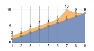
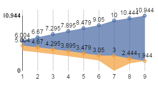
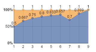
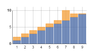
Area Charts
For area charts, you can choose between stacked, stream, and expanded views.
Stacked view is the default view. Each series starts at zero and overlaps the visible area:
Stream view displays the data in the middle of the chart, with each series shown as an appropriate amount of area:
Expanded view displays each series as a percentage of the total:
Bar Charts
Bar charts have two options: grouped and stacked.
Grouped view is the default view. It displays the data point for each series side by side, with a space between data points:
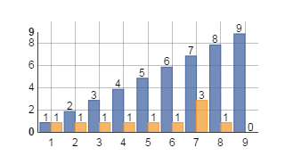
Stacked view displays the series on top of each other:
Hiding Series
When a chart has more than one series, you can hide individual series by clicking on the name of the series in the legend. Hidden series are shown with a hollow circle in the legend instead of a filled in circle.
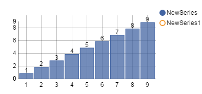
Click on the series name a second time to display it on the chart again.